Visualizing Functions of Several Variables
$$
$$
Density plots (heat maps)
A real function of two variables \(f:\mathbb{R}^2 \to \mathbb{R}\) can be visualized on some region in \(\mathbf{R}^2\) by associating each value with a color, and then coloring the region according to the values of \(f\). Usually some sort of color gradient is used for this.
Examples
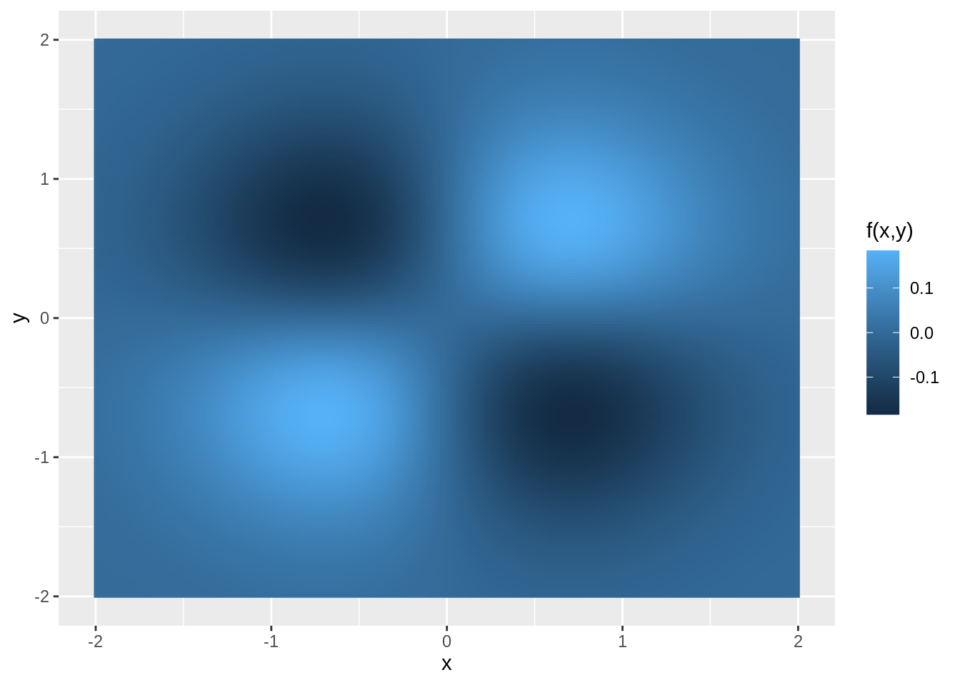
A density plot of the function \(f(x,y) = xye^{-x^2-y^2}\):
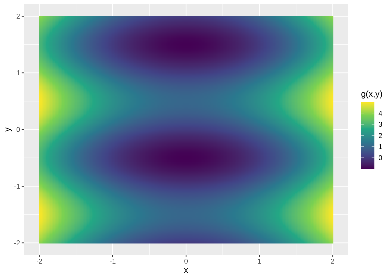
A density plot of the function \(g(x,y) = x^2 + \sin\pi y\):
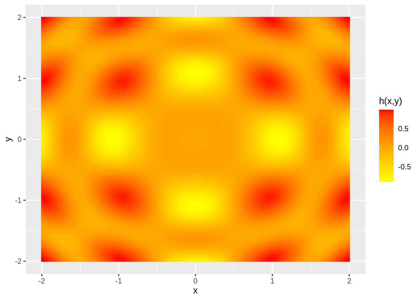
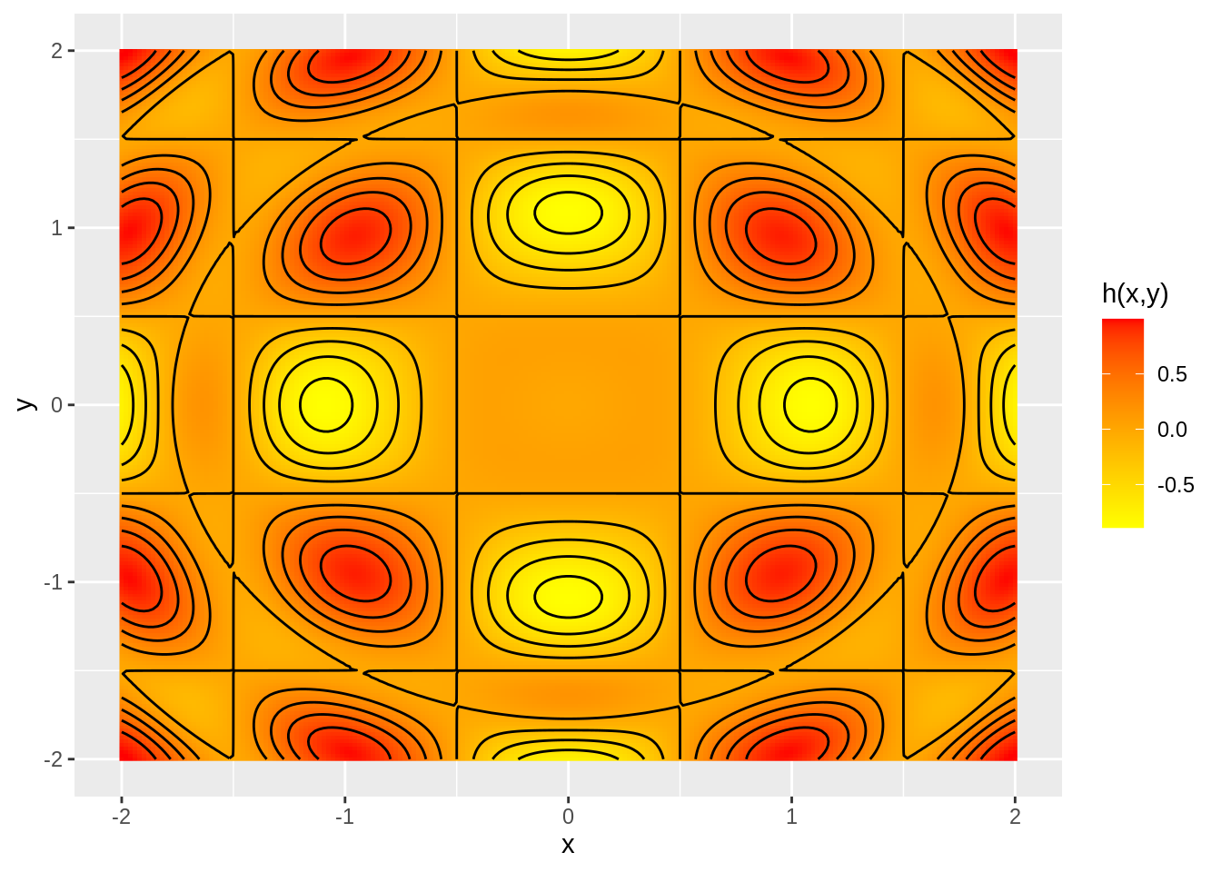
A density plot of the function \(h(x,y) = \cos(\pi x)\cos(\pi y)\sin(x^2+y^2)\):
Surface plots
Another popular way is a direct generalization of the traditional way of graphing real function of one real variable on the Cartesian plane: we use the horizontal axis for inputs and the vertical axis for outputs, and for each input \(x\) we color the point \((x,f(x))\), creating a curve that is called the graph of the function \(f\).
Formally, for a function \(f:\mathbb{R} \to\mathbb{R}\) with domain \(D\), we say that the graph of \(f\) is the set
\[\left\{(x,y)\in\mathbb{R}^2; x \in D \text{ and } y = f(x)\right\}\]
We can do the same thing for functions of two variables. Now the inputs are points on a plane (the horizontal coordinate plane, usually called the \(xy\)-plane), while the outputs are points on the vertical (\(z\)) axis:
In this case the graph is typically a surface in \(\mathbb{R}^3\). Formally the graph of a function \(f:\mathbb{R}^2 \to \mathbb{R}\) with domain \(D \subseteq \mathbb{R}^2\) is the set
\[\left\{(x,y,z)\in\mathbb{R}^3; (x,y) \in D \text{ and } z = f(x,y)\right\}\]
Examples
A surface plot of the function \(f(x,y) = xye^{-x^2-y^2}\):
A surface plot of the function \(g(x,y) = x^2 + \sin\pi y\):
A surface plot of the function \(h(x,y) = \cos(\pi x)\cos(\pi y)\sin(x^2+y^2)\):
Try it yourself
Contour plots (level curves)
Another way of visualizing functions of two variables is by drawing so called level curves, and creating a type of plot called contour plot.
The idea of a level is simple: you chose some value \(c\) and then color all the points \((x,y)\) in (some region of) \(\mathbb{R}^2\) at which \(f(x,y) = c\). This will typically create a curve in \(\mathbb{R}^2\), which is called the level curve of \(f\) at the level \(c\).
To get a contour plot, you choose a sequence of levels (usually equally spaced), and create a level curve of \(f\) at each of these levels.
Examples
A contour plot of the function \(f(x,y) = xye^{-x^2-y^2}\):
Warning: The dot-dot notation (`..level..`) was deprecated in ggplot2 3.4.0.
ℹ Please use `after_stat(level)` instead.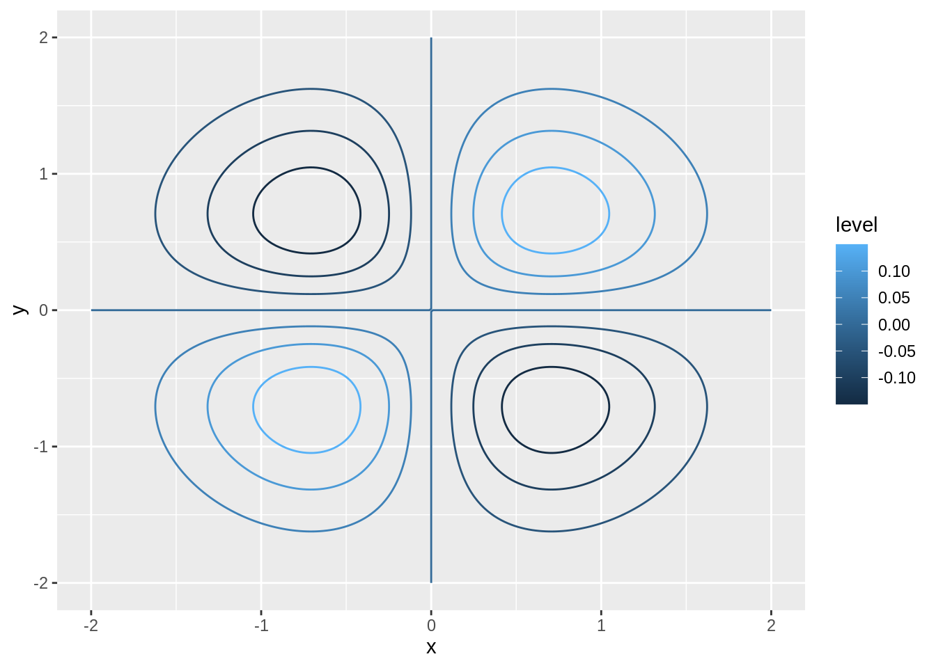
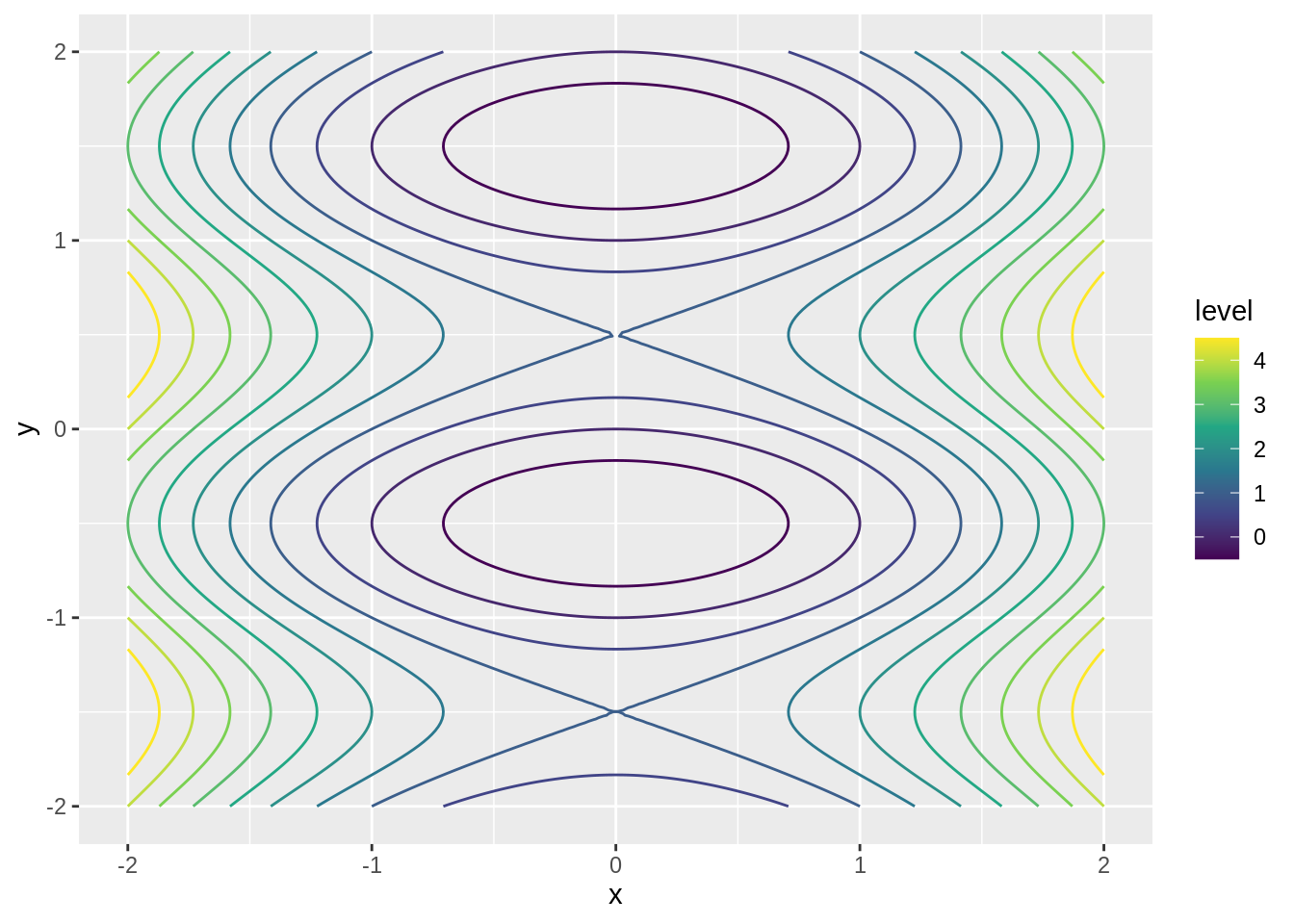
A contour plot of the function \(g(x,y) = x^2 + \sin\pi y\):
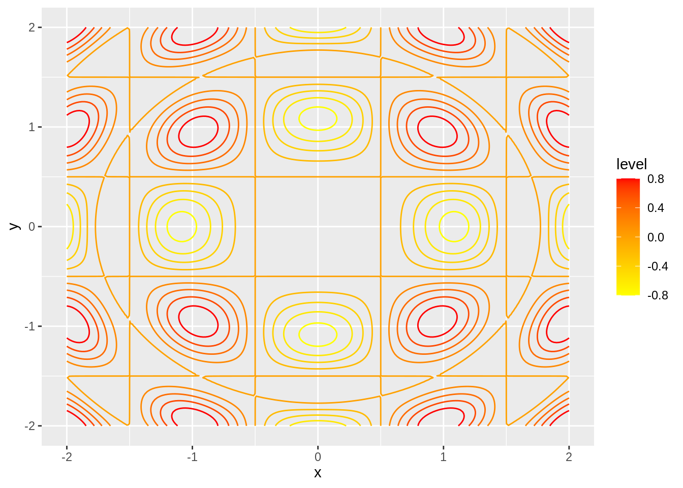
A contour plot of the function \(h(x,y) = \cos(\pi x)\cos(\pi y)\sin(x^2+y^2)\):
Sometimes it is good to combine a contour plot with a density plot:
Try it yourself
Functions of three variables, level surfaces
Visualizing functions of three variables is much harder. One thing that sometimes work is a generalization of level curves to three variables, to so called level surfaces. The idea is exactly the same as for level curves. In order to keep plots from getting messy, we usually plot only few level surfaces. A common practice is to make the surfaces semi-transparent so one can see the “inner” surfaces underneath the “outer” ones. Also, often some part of the surfaces is cut out so it is possible to see “inside”.
Example
The surface plot of the function \(f(x,y,z) = 2x^2 + 3y^2 - z^2\). Four level surfaces are drawn, at the levels \(-\frac{1}{2}\), \(0\), \(\frac{1}{2}\) and \(1\):